1Wheel Landing Page
Designed a landing page for 1Wheel, an Australian car-selling platform, to establish a digital presence and enhance user experience.
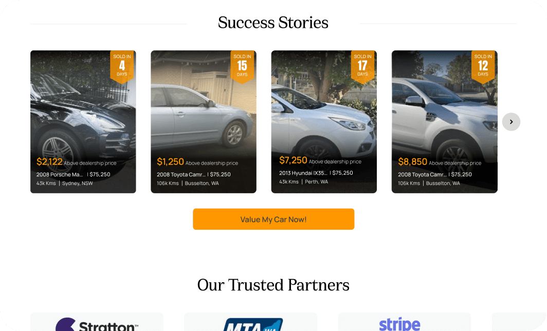
Developed branding guidelines and key features such as a car value calculator. The project improved information flow and integrated a "Certified Cars" section.
Role
UI Designer
Project Type
Client Work
Date
Jul’24
OBJECTIVES
Need of Landing Page
Setting up the branding guidelines
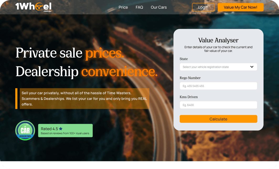
Creating a landing page for one of the Australian car selling brand. The founders were looking for a designer who would help them with defining a style for their soon to launch webapp.
Digital presence
They wanted to have a landing page for their digital .business front that explains about the business while helping users choose the right way to sell the car.
Bored of old webpage
The client got bored of the old design and thus wanted me to design a landing page for 1Wheel. It is an Australian platform that simplifies the car-selling process.

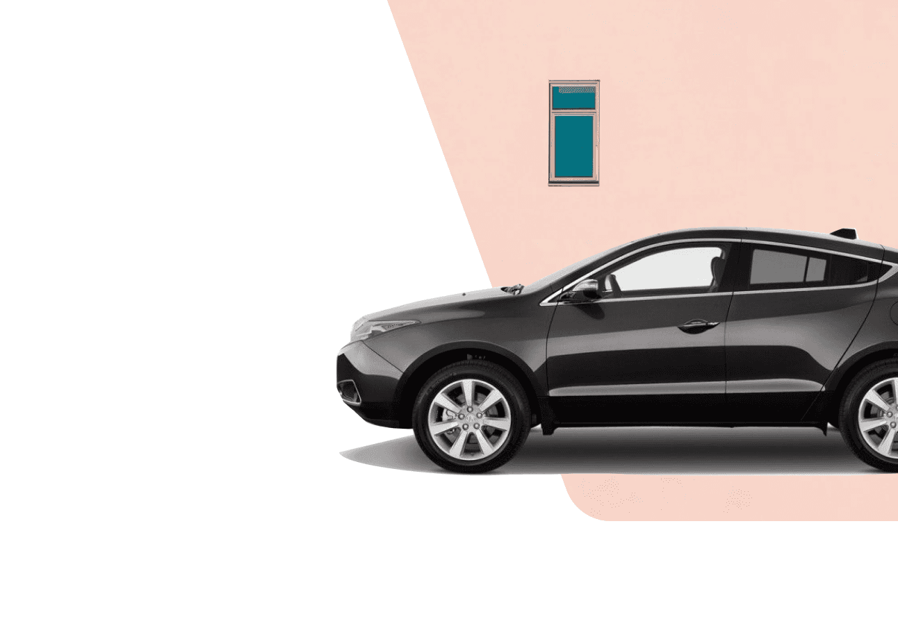
The outdated hero section.
ABOUT 1WHEEL
The Business
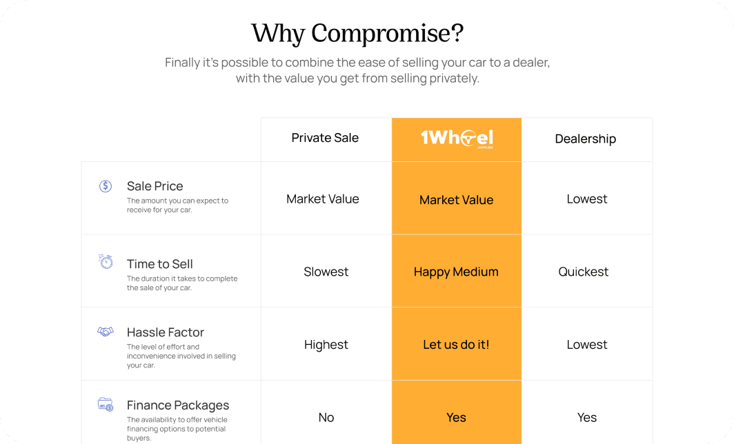
1Wheel is a platform that helps users to sell their car with ease without getting in to the hassle of visitors or compromising on the savings made that are there with traditional dealerships and Facebook marketplace.
Mission
Help users sell their cars privately without the hassle of visitors, scammers, or dealerships.
Unique Selling Point
They claim of no sale, no fee guarantee to the customers..
DESIGN CHALLENGES
Client Requirements
Design Freedom
No restrictions, primary color must be Orange. They had no restrictions on the design however, the main color/primary color was Orange (#FF9800).
This made it a bit tough to create a look for this website as I was restricted to make a feeling for a car selling platform.
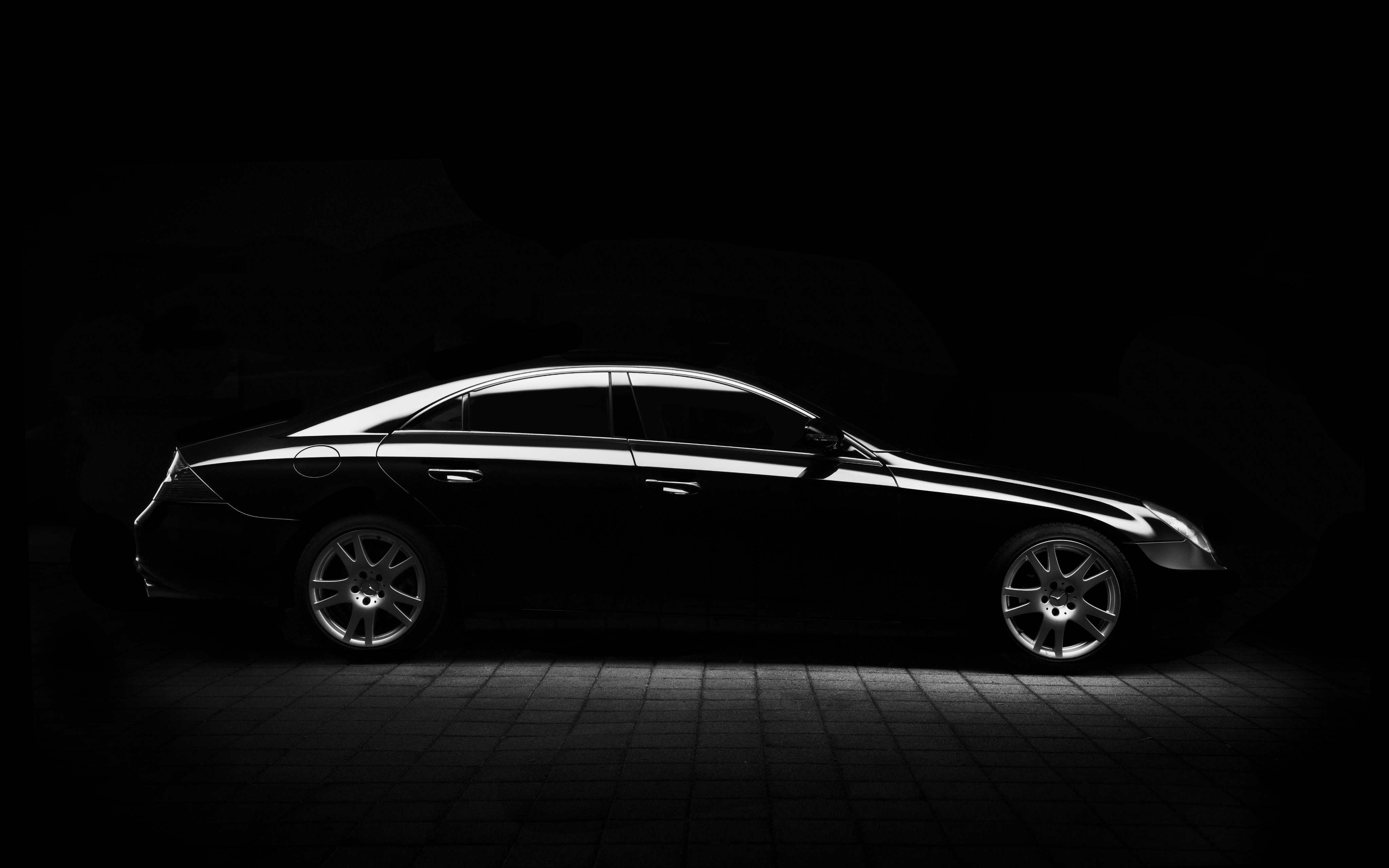
I wanted to go for a black/red or blue/green combination.

The original color palette
Logo
The initial logo was a two coloured logo, giving it a different appearance, however, the clients felt that they need the logo to be monochrome. Thus, the final design showcases logo in a single color.
Value Calculator
The hero section boasted of a car value calculator. However, fitting the required information of the result page in the same height was a challenge, as I had to compromise on the font size, spacing to fit things together.


Photo by Tim Mossholder from Pexels: https://www.pexels.com/photo/closeup-photo-of-brown-surface-1154739/
DESIGN CHOICES
Creating Magic
Typography
For the type, I went for a combination of Serif and San-Serif.
The Serif was PP Cirka, credits to Pangram Pangram ↗. While the San-serif was Manrope.
This allowed for the website to get a feeling of Sharpness due to the serif, allowing for a premium feel. And the readability aspect of the San-serif looked for maintaining that feeling.
Another combination was going all in with general sans to give it the SAAS feel however, I was told to not go for that typical SAAS look.


Shapes
I tried couple of variations of how playful shapes can bring in character to the website. This meant, looking for references that would suit the intent.
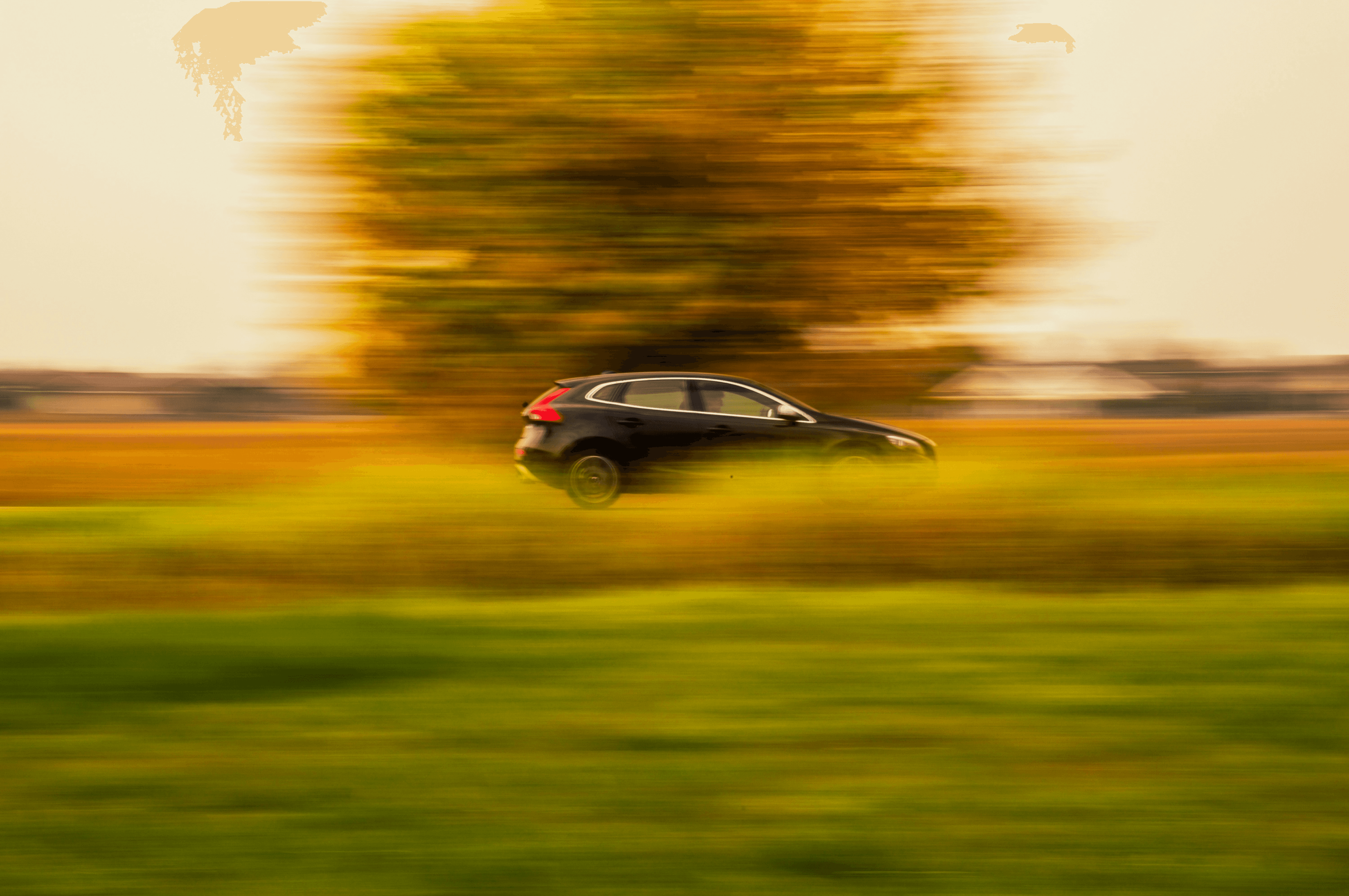
Hero Images
There was a tough choice about which directions should we go with. In the beginning, Shots of car were being used but somehow, It didn’t click with them.
Then another approach was done, which was to use the Australian landscape to provide that feeling of connection with the user group.
Thus at last, the image for the hero section was decided.

Miscellaneous Sections
Some sections were also kind of hard to let go.
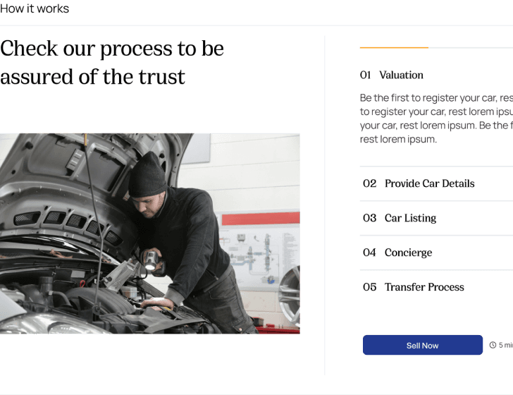
How it works
For this, the initial idea was to have a timer that shows each step along with the image in an accordion menu sort of structure. But it was not accepted since for each step, the users would have to wait for the timer.
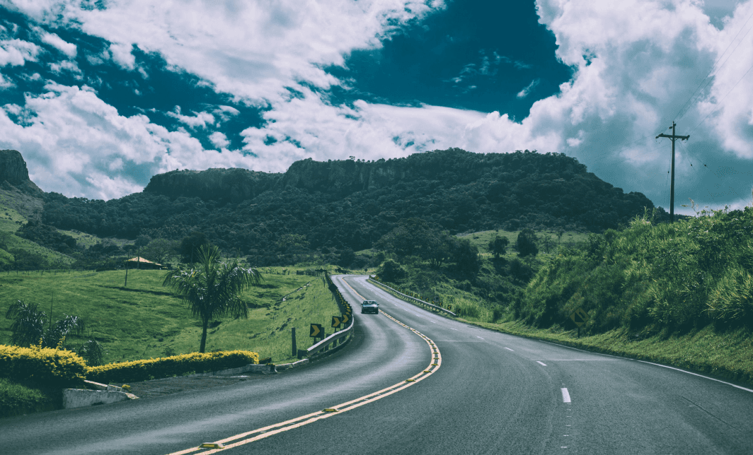
Photo by Kaique Rocha from Pexels: https://www.pexels.com/photo/green-vehicle-on-concrete-road-57645/
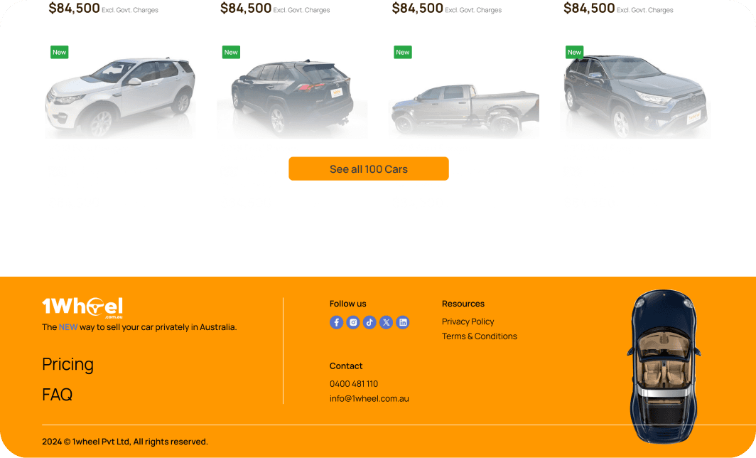
FINAL OUTCOME
The Landing Page
The landing page helped in creating the identity that extended to the other pages.
LEARNINGS
Reflections from the project
Design Constraints & Client Collaboration
Design Constraints
Working within the primary color restriction taught me that a lot can be done even if we are restricted with the colors and logo.
Client Collaboration
Something that I learnt is to not give the editable figma file to the client, else they try to make changes on the auto-layouted designs and when things go south, only then you are notified of the changes. Still figuring out the best way to this.
Photo by cottonbro studio from Pexels: https://www.pexels.com/photo/man-in-blue-dress-shirt-and-gray-pants-standing-beside-white-car-4489760/
WORK GLIMPS
Curated Project Work